
You know that your course deserves a lot of time and energy. But, there’s another feature of your online business that deserves just as much consideration—your course sales page. Your sales page is your best asset for proving your course’s value and cluing your audience in to the transformation they can expect to experience as your student. We’re breaking down exactly why a powerful sales page matters.
Power lies in clarity
When presented with two similar products consumers will always search for clues that one is more closely aligned to their needs and values than the other. You could have the absolute best resource for your niche, but if you’re not making that clear on your sales page, it’ll be hard to convince people to buy.
To create a powerful sales page for your course, think about two things:
- The copy
- The structure
Persuasive, authoritative copy builds trust with your audience and gives them points to relate to you on. But good copy alone won’t make a sale. You also have to make sure you structure your powerful sales page in a logical way that makes it seamless and easy for people to purchase.
{{uplevelsales-component="/blog-shortcodes/call-to-action"}}
Writing strong sales copy
If sales copy intimidates you, you’re not alone. Even skilled bloggers and content marketers make the mistake of writing sales copy as they would any other copy. But, your sales copy must be distinct because unlike a blog post, the end goal on a sales page is a purchase.
Great sales copy conveys at least two things: the value of your product and the urgency to enroll now.
How to write effective sales copy
You can think of writing sales copy as a step-by-step process. When executed correctly, sales copy can result in increased sales and more income for you. Here’s how to get started:
1. Define your audience
Your course isn’t a perfect one-size-fits-all solution for everyone. You shouldn’t advertise it as such. Before you write a line of copy, figure out exactly who your target audience is. Consider these factors:
- Is your course better suited for novices or someone who already knows the basics?
- What is the end goal of taking your online course? What transformation are you providing?
- If you had to describe them, who would your ideal customer be?
- Who is your course not for?
As you answer these questions, a persona will start to emerge. The more specific you can get, the better (imagine one person, maybe someone you know).
If you know that your target persona is a 55-year-old male who is a first-time entrepreneur honing his business idea, it’s much easier to develop copy that’s persuasive. You’ll be able to talk about technology and business in a way that makes the most sense to him, which will make it a no-brainer for him to take your course. After all, you understand him, and he can trust you.
An expert’s eye
Take a look at how Melyssa Griffin clearly describes who her online course is best fit for and who isn’t right for taking Pinfinite Growth.

Off the bat she says that this course is perfect for bloggers new and old. She states strategies in her online course will help anyone looking to grow their traffic and email list. Furthermore, the course is perfect for busy folk who are looking to run their Pinterest on autopilot without having to devote a ton of time or energy to the program.
By making it clear who you’re targeting with your course you accomplish two things:
- You make your target audience feel included when they see themselves in your “who this course is for” section
- You will have fewer people asking for refunds, because if a potential customer doesn’t fit into your “who this course is for” section they’ll be less likely to buy your course in the first place
2. Make your sales page easy to digest
A powerful sales page should be easily scannable and digestible. Your audience is likely to first scan a sales page before diving in. Divide your sales page into very clear sections set apart by images, graphs, and color blocking. You can also use plenty of bold text and colorful text to make certain points and statements stand out.
Your audience members should be able to take a very quick, 15-second look at your sales page as a whole and already have an idea of whether or not your course is going to be a fit for them. Based on an initial scan, your audience will decide whether they should stick around.
Try the following to making your page easy to scan:
- Use very clear headers – You can use headers to break up different sections in your sales page. They can be simple (i.e. “Testimonials”) or a bit punchier (i.e. “What people are saying.”) Regardless, including headers will help your audience know what to expect and prompt them to read your page.
- Vary text size and color – A huge wall of text is going to overwhelm your audience and encourage them to click away from your sales page. Using a variety of text types will make your page easier to read and encourage your audience to stick around and read more.
- Include negative space to make your page easy to read – Negative space is simply the area on your sales page that has no text or images aka white space. Adequate negative space keeps your page from looking too busy or overwhelming, and invites your audience to stick around a bit longer.
- Add images to break up the text – Much like the other tips mentioned here, images are going to make your sales page less intimidating. Images also serve to draw the reader’s eye, so make sure the copy surrounding the images is persuasive.
This one step will encourage significantly more people to stick around and take the time to read your page, giving you more opportunity to win your audience over via your superior sales copy.
At Teachable, we make dividing up your sales page simple. Our default template breaks up the sections for you. And, our text editor makes adding heading and different sized text simple.
3. Tell a story
As an entrepreneur your story matters. And, telling a story on your sales page can really help your audience connect with you and your product. By painting a vivid picture of who can benefit from your product and the problems you’re going to solve, you can help people connect with your product. Start by telling your own story or sharing a case study featuring a friend or client you helped. This increases your authority and adds to a powerful sales page.
Describing a clear pain point that your online course is going to solve. Then explain how your course will help your students overcome that pain point. Doing so is very valuable in creating a powerful sales page.
4. Overcome objections
People naturally try to talk themselves out of making big purchase—whether it’s a new vacuum cleaner or an online course that can transform their life or business.
You need to nip that tendency in the bud.
Address any rational concerns someone might have when it comes to buying your course. Frame your online course as the best possible solution for the problems that your audience is having.
Common objections may be:
- “This course is expensive.” If you haven’t effectively conveyed the value of your course, people may think of it as expensive rather than valuable.
- “I could learn how to do this on my own.” In the internet age you can learn basically whatever you fancy online and for free. But that’s not the point of online courses. Online courses are a shortcut to an outcome and that’s what you have to emphasize in your copy. Say something like, “It took me two years to master this concept, but I’ll get you to where I am in just three weeks.”
- “Why would I buy from you when _______ is selling a course on the same topic?” A lot of course instructors get a case of “imposter syndrome” where they feel that they’re not enough of an expert to be selling a course on their topic, and that thought might run through your student’s minds, too. Say something like, “I’ve been where you’ve been, and it wasn’t all that long ago. I remember what you’re going through because I was in your shoes just two years ago. I’m not some expert who has been teaching on this topic for 20 years and has long since forgotten what it feels like to be in the beginning stages, I’m simply someone who figured out what works and wants to share my method with you.”
- “But how do I know I can trust you?” Chances are you customers have never met you, and you could be anyone hiding behind a fake online identity. Building trust online is a very important component of making sales. One way to build trust is through testimonials. Testimonials show that other people trusted you and are glad that they did.
5. Use clear calls to action
A call to action is exactly what it sounds like: text or an image that’s calling out to your reader to take an action. And, it can be as simple as “Enroll now!” or a little punchier, “Join the fun and buy today!”
It’s easy to worry about being salesy and opt for softer calls to action, like “Learn More.” But if your copy is doing its job, your future students are looking for a clear button that tells them exactly where to purchase. So, be upfront and ask people to purchase or sign up for your course, because that’s why you brought them to your sales page in the first place (and that’s why they’re there).
6. Use benefit-driven language
Benefit-driven language presents your course to your audience in a way that appeals to them and their needs. Instead of saying, “I’m giving you five hours worth of content that I spent two months creating!” You can say “After taking this course you’ll be able X which will result in Y and Z.”
Make sure that your sales copy is less about you and more about your audience and your online course. Here is an example of benefit driven language from Reach Your Readers by Creativindie.

Benefit-driven language helps people visualize what the outcome of the course will be, and they’re going to be more excited to buy.
Get inspired
Here are five great online voices to subscribe to for tips:
- The Copy Cure – This is free training from Laura Belgray and Marie Forleo brings actionable tips (some that I’ve mentioned here) to your inbox.
- Noah Kagan – A marketer who has built his brand on his writing style. His blog OkDork is filled with personality and actionable advice.
- MozBlog – Notice how clean each article is. Some of it is long and detailed, but it’s all there for a reason.
- Contently – Contently is an industry leader publishing articles on content marketing and copy.
- CopyHackers – Joanna Wiebe has some great content you can learn from on how to make your copy compelling.
Now, let’s take a look at the actual structure to use for your sales page.
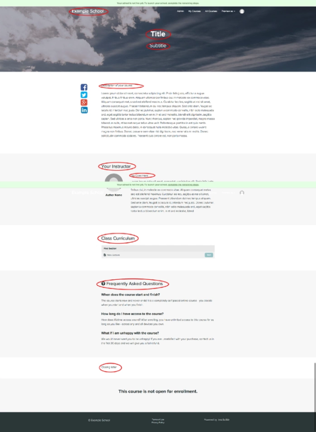
The nine-step sales page formula
When it comes to the design of a powerful sales page, there is a simple formula you can follow for maximum results.
- Headline/hero
- Course description
- Case study/testimonial
- Call to action button (CTA)
- Instructor bio
- Case study/testimonial
- FAQs
- Call to action button (CTA)
Luckily, Teachable’s sales page editor makes following this formula to create a beautiful sales page that converts easy and intuitive.
Headlines and heroes
The headline is your first place to really wow your potential customers and get them intrigued. In this example from “Creating a Profitable Podcast” you can see they use:
- Eye-catching colors
- Descriptive language
They give their most eager students a chance to enroll right on top of the page. Your Teachable school comes with a hero CTA right out of the box.

Now, you don’t have to use bright colors if they aren’t part of your brand. But, do consider color theory and how your colors are playing together. Make sure that your text isn’t hard to reach or blending into the background. The color wheel from Canva is a great resource.
As for using descriptive language, think of words like: ‘profitable’, ‘valuable’, and ‘monetizing’. These are powerful words because they are very clear and get at one of the primary things that drives people’s behavior—money. It’s more valuable to teach someone how to do something and be successful with it than just teach them how to do something.
Course description
Now that you have your audience’s attention, hook them in with a powerful course description. Create a description that will appeal to your ideal audience and get them excited about the prospect of taking your online course.
One thing to make sure you’re establishing when creating a powerful sales page: your transformation. What exactly will your audience get from taking your online course? Make it very clear what you’re setting out to teach.
Here’s a great example of a course description from Contino Workshop.
“Join me, alphastructaesthetitologist* Jon Contino, as I walk you through every step it takes to become a master lettering artist! From the history of written language all the way to customizing letters for logo design, this class will provide you with the tools it takes to make, break and rebuild letterforms into strong, interesting and unique works of art.
In this super-efficient crash course, I will share vital and core knowledge of typography history, the tools it takes to design letters, explain in detail how to master fundamental lettering and, of course, how to create your own style.
With 37 lecture and demonstration videos, a PDF workbook, and a detailed list of resources and where to get them, this class will benefit everyone from the first-time lettering artist to the seasoned pro!“
This description works because Jon:
- Describes exactly what the course was going to teach his students.
- Uses phrases such as “super-efficient” that hint at his course’s value. Remember, courses are a short-cut to an outcome. People want to learn as quickly as possible!
- Throws in a bonus. Even if you’re planning on offering free consultations with your course, consider framing them as an added bonus your students get on top of their purchase.
- Defines who his course was for: “Everyone from the first-time lettering artist to the seasoned pro.”
Case study or testimonial
A case study is a narrative account of someone’s experience after they’ve gone through your curriculum and benefited from it. For example, if you’re teaching how to negotiate for a raise in your corporate job, take a look at someone who took your course and successfully negotiated her biggest raise to date.
A testimonial is someone singing your or your course’s praise. Your call to action is simply the place where you’re going to urge your audience to take the plunge and purchase your online course. It could appear as a button or a hyperlink depending on the design of your site.
Instructor bio
Introduce yourself! People are going to be curious about who you are and what your credentials may be.
Depending on the nature of your online course, you might want to include the following:
- How long you’ve been in your field
- Any exciting highlights from your time in the field
- Any opportunities your skill has given you
Here’s a great instructor bio from Coding Explained:

Curriculum
If people are still on the edge of deciding whether or not to purchase, giving them a sneak peek of your curriculum can help them get excited. Here’s an example of how that might look from Pitch Perfect by Elana Gross.

Another case study or testimonial
Again, highlight how incredible your course is by sharing someone else’s experiences with it. Interspersing your sales page with endorsement from others is a subtle way to make major progress on convincing someone to buy your course.
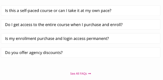
FAQs
The more thorough your FAQ section is, the less time you’ll spend answering the same question over and over again via email. Your FAQ can calm your audience’s fears over things like refund policies. And, it also help them understand the nature of your online course a little bit better.
Here is a great example of an FAQ Section from Content Strategist Certification Course.
CTA
Here’s your final CTA. Hopefully by now your audience has made up their mind to purchase. And your last CTA is going to make it easy. Having multiple opportunities to buy on your page helps prevents your future customers from hunting for your “buy” button.
Three golden rules for powerful sales page design
When you’re designing your sales page, it’s easy to go overboard. But a few key design tips can prevent that:
- Make your text black or dark gray. You can even get away with a very dark blue, purple, or maroon but choose your colors wisely. You may be super excited about your course and that compels you to want to use a bright, happy yellow for your main font, but that’s hard to read. Definitely incorporate color into other aspects of your sales page, but when it comes to the text, simple is often better.
- Choose a color scheme. Do this so you’ve got brand consistency and your entire sales page is streamlined. If you choose from three or four main colors your page will look more polished and put together.
- Be picky with your stock images. Ask yourself: Can your customers see themselves in your pictures? Maybe you love the picture of the graceful ballerina leaping with an arm full of roses, but if your course is about fashion for the office that image won’t translate well. There are so many stock image sites available, with a bit of digging you can find pictures that fit your brand, perfectly.
Tags:
More like this


Your weekly dose of creative chat and Teachable updates. Get our weekly newsletter.